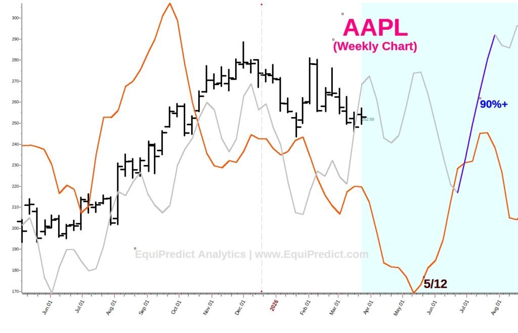
The following charts are weekly time-frame charts of Apple Inc. (Ticker: AAPL).
Each chart expands upon click.
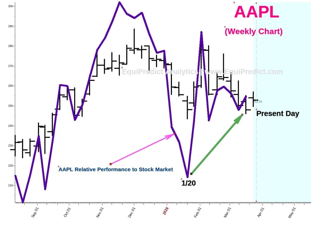
Wall Street has been allocating institutional capital to the stock during the recent market correction. This is demonstrated by the fact AAPL has been outperforming the stock market since January (see Chart #1).
The indigo colored line is a relative performance reading comparing AAPL’s stock performance against the S&P 500.
Looking solely at the price-action (black bars), AAPL’s stock price has provided a near 0% return since mid-January 2026. However, the performance reading (indigo line) has been rising; indicating out-performance of the stock compared to the market over that same period.
The chart below is a classic bullish divergence technical ‘buy-signal’ set-up.
In looking ahead, the below forecast is a composite model of exogenous data pointing to an ideal time to acquire shares: Mid-May 2026.
A Blue Wave forecast has also been overlaid on the chart carrying a 90% probability for bullish bias over the time-frame shown on the chart. This provides added evidence that the time-frame on the chart should yield bullish bias price action for the stock price.
(Note: unless explicitly stated, forecasts are not magnitude-of-move forecasts, but are purely calendar-tied bullish bias / bearish bias or consolidation period forecasts)