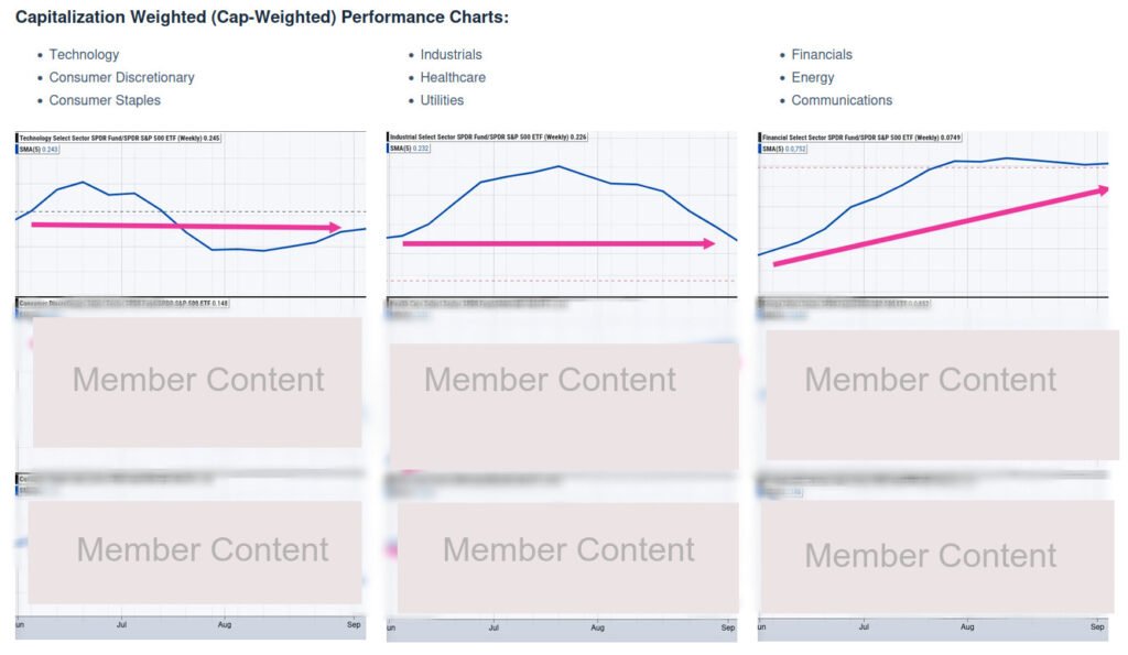
The Sector Performance Charts have been updated.
Members have access to these performance charts within the Dashboard to help see “under the hood” of Wall Street and the risk appetite of institutional fund managers.
The Sector Performance Charts have been changed to quarterly time-frames to keep in-line with quarterly earnings announcements.
By viewing quarterly results instead of monthly results (i.e. – sector performance June 1st through September 1st) and combining the quarterly snapshot with strongest sector earnings results, medium-term traders and investors will have a good grasp on Wall Street’s risk appetite going into the next quarter.
Below is a sample of the new quarterly Sector Performance Charts with annotations.
Sample snapshot expands upon click.