There are two charts included here.
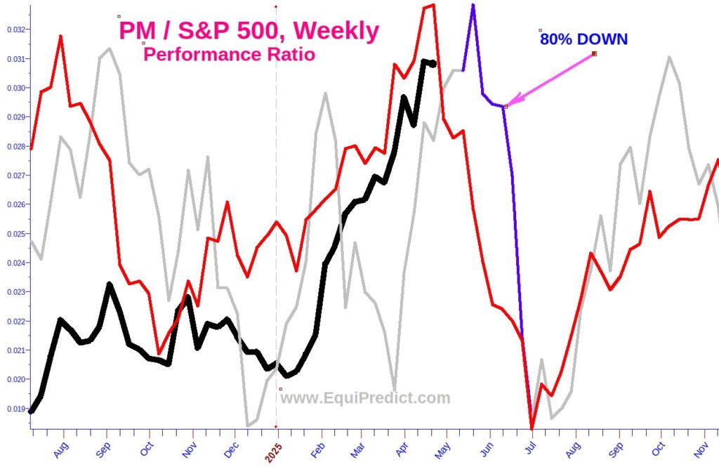
The first chart is a performance ratio (solid black line) of Philip Morris’s stock (Ticker: PM) in comparison to the S&P 500. When the black line is rising, it means PM is OUTPERFORMING the stock market. If the black line is falling, it means PM’s stock is UNDERPERFORMING the stock market.
Ratios like these are how Wall Street investment bankers outperform indices. Note: just because a stock is outperforming the stock market, does not necessarily mean the stock’s price is rising. If the stock market is falling, it would indicate the particular stock is falling LESS THAN the overall market.
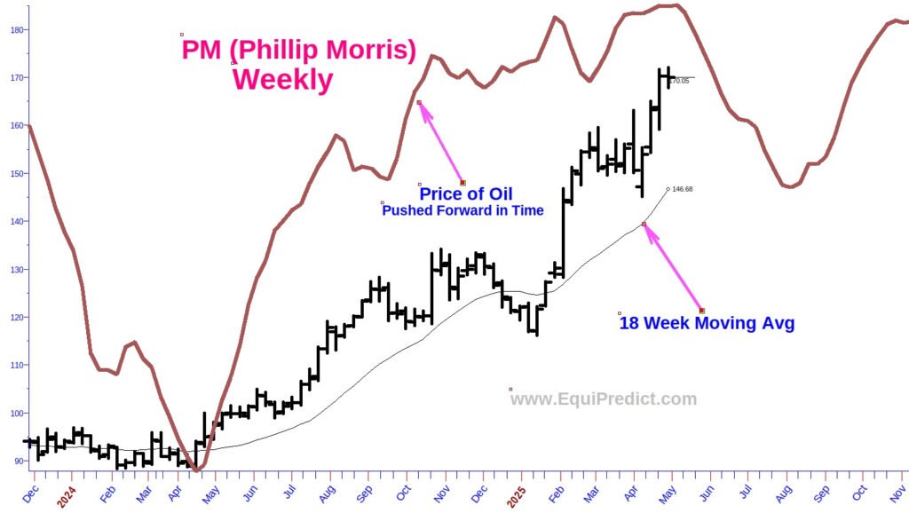
The second chart is the stock price of PM and its correlation with the price of oil, pushed forward in time. Historically oil and PM’s stock price have been highly correlated.
Both charts are currently signaling a period of consolidation or pressure on PM’s stock price until mid to late July. Note also that the stock price has become stretched from the 18-week moving average. A better time to re-examine acquiring shares in PM would mid-July or very early August according to the forecast. Mark your calendars to revisit the stock at that time.
Charts expand upon click.