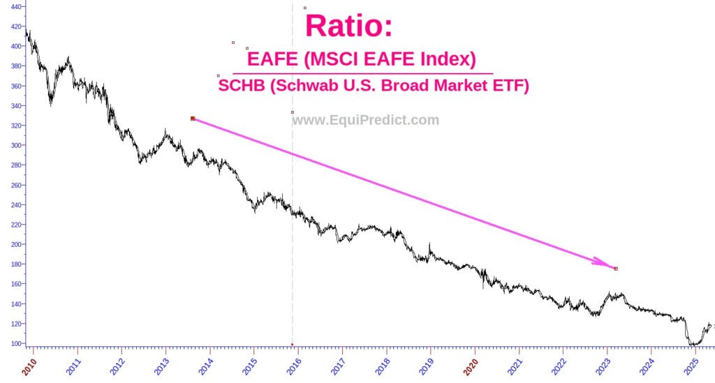
The chart below is a ratio chart—a visual comparison of two indices, much like a fraction where the numerator and denominator impact the direction of the line.
Here’s what this ratio tracks:
- Numerator: The EAFE Index (Europe, Australasia, and the Far East) — a benchmark for large- and mid-cap stocks in developed markets outside the US and Canada.
- Denominator: The SCHB ETF — the Schwab US Broad Market ETF, which tracks a cap-weighted index of the largest 2,500 US-listed companies.
Interpreting the Chart:
- When the line is falling, it indicates US companies (SCHB) are outperforming their international peers (EAFE).
- When the line is rising, international companies are gaining ground.
Despite occasional short-term reversals (like the slight upward tick since early 2025), the long-term trend has been clear: capital continues to favor US-based companies.
Why Does This Happen?
This persistent outperformance is not about politics or culture — it’s largely driven by the US tax code, which is uniquely structured to attract innovation and investment. This structural advantage helps fuel consistent growth and profitability among American firms.
So, next time headlines suggest that “money is flowing out of the US,” take a closer look at this ratio chart. Over the long term, US equities continue to dominate global markets.
Note: Forecast models suggest the recent EAFE outperformance is likely short-lived, with a rollover expected soon.
Click chart to enlarge.