How to Interpret Red, Blue, and Green Wave Forecasts (Applies to Equities)
Red Wave Forecasts
Red Wave Forecasts: the chart below is a Red Wave EquiPredict forecast. The forecast line is one of our original forecasting models. All forecasts are tied to calendar dates (not price points).
To interpret the below forecast chart, the market participant would be looking for bullish bias in the given stock starting around January 10th, and remaining in-place until around February 20th. The first chart is the forecast. The second chart is the result.
Exact calendar dates will be published when they are available (when precision of dates is available). Bullish bias = stock price should be expected to experience lift.
IMPORTANT NOTE: forecast lines DO NOT forecast magnitude of moves. Forecast lines point to underlying behavior of the share price only.
Each chart expands upon click.


Blue Wave Forecasts
Similar to Red Wave forecasts, Blue Wave forecasts are using data outside of data used in Red Wave forecasts. Interpretation is the same as Red and Green Wave forecasts. See below two charts. First chart is forecast. Second chart is result.
Bullish bias is expected to begin mid-October for the given security and terminate in early January at the turn of the year. Price can continue to run (bullish bias may continue) but forecasts are focused on highest probability outcomes related to given calendar dates. Calendar dates and potential for repeat occurrence in ANY forecast is not a guaranteed each month, quarter, or year.
Grey shaded areas of the forecasts should be largely ignored. Sometimes they will move in conjunction with price, other times not. The highlighted Blue Wave portion is the wave to focus on.
Charts expand upon click.


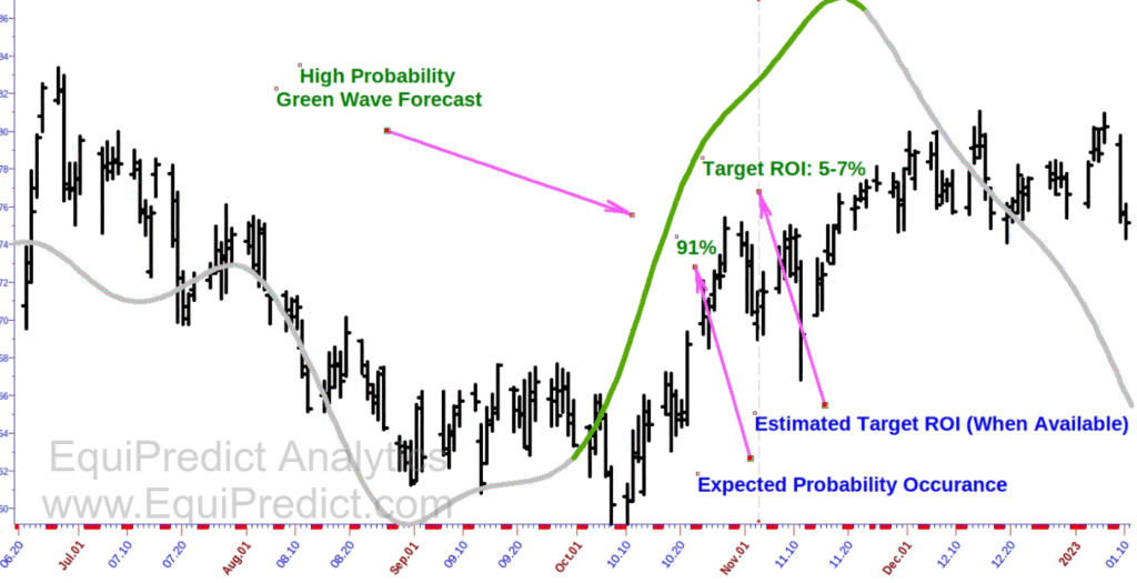
Green Wave Forecasts
Green Wave forecasts are the newest model to EquiPredict. They are difficult to locate but carry with them very high probability outcomes. Interpret the forecast in the same manner as Red and Blue Wave forecasts. First chart is forecast. Second chart is result.
Green Wave forecasts can also include (when available) an expected target ROI over the time period. In the chart below, bullish bias is expected to begin around October 1st and terminate around November 22nd.
Chart expands upon click.

Exogenous Data Forecasts
Exogenous Data Forecasts are complex in nature and use data not directly related to the underlying security. Exogenous Data forecasts are “drivers” of the price action ahead. They are to be interpreted in a different manner than the Red, Blue and Green Wave forecasts. Price action is generally expected to follow the path of the Exogenous Data forecasts in the weeks and months ahead. These are expected to be stable forecasts DRIVING the price action ahead in the direction forecasted.
A simple and well known example of exogenous data (below) would be the price of oil pushed forward in time about 37 weeks (and sometimes 150 weeks). The price of oil has a historical tendency to forecast the Dow Jones Industrial Average.
The first chart is the price of oil in 2021 pushed forward in time, forecasting price in the Dow Jones to come down. Second chart is result. See below:


Low Volatility and High Volatility Market Examples with Technical Analysis
Low Volatility and Trending Market Usage:
In order to get the most out of the EquiPredict forecasts and Newsletter alerts, it is prudent to combine the EquiPredict projected forecasts with an indicator of your preference during periods of lower volatility and trending markets.
Charts included here outline a best practice when using the forecasts.
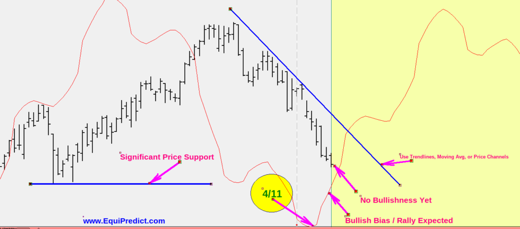
The above chart shows a simplified EquiPredict model (red line) forecasting a rally on or just after 4/11. Those considering going long on the exact forecast date may do so, however, it is often best to wait for price to confirm. A confirmation (trigger) of the signal to buy (the projected rally date) might be a break above a downtrend line, or cross and close above a moving average, or close above a price channel. These are merely suggestions. However, price action should be your first and final point of reference. Trade what you see.
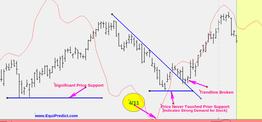
The subsequent chart here shows a rally commenced. We have three pieces of strong, supporting evidence that the rally has legs.
A) Price action broke above the downtrend line
B) As price action broke above the downtrend line, price never reached prior significant support
C) The “double bottom” after the downtrend break produced a higher-low, further supporting evidence of strong demand for the stock
Higher Volatility Market Usage:
In the event of higher volatility, such as in the chart below, the EquiPredict model still functions as it should. But during these times it’s critical to focus on the calendar more so than on pure price action. Here is an example of what this means:

In the example above, a clear rally signal was given by the EquiPredict forecast model (red line), in advance, for July 17th. If a trader were to enter on this bar on this exact date, high frequency trading algorithms (HFTs) proceeded to take out stops about 2 weeks later (pink arrow).
The prior significant low and turning point (blue arrow) was slightly surpassed by the seek and destroy HFT algorithms as they are aware this is where many traders place their stops (just below prior significant swing low (blue arrow).
Had the trader using the EquiPredict system entered the trade on 7/17 and checked back in on their position 3 weeks later, they would have noticed the model is working as it should and leading the price to its next significant peak and potential profit taking/selling date on 8/28 (green arrows).
As with any important risk management plan, stops should still be strictly minded; but in a general bull market situation, when it comes to higher quality time-tested stocks, stops should be placed farther from the market to avoid getting stopped out by HFTs while working with an EquiPredict rally point forecast and projection as in the above chart.