What Is “Reverse Bearish Divergence”?

When You See this Pattern Unfolding, Pay Close Attention To What’s Coming Next!
The talk of most traders on the internet is always “bullish divergences”. Most traders spot them and they become all the rage – an indicator or two begins to rise while price continues to fall.
But what is not shared often (because it’s not that sexy) is that price action is king – full stop. There is no other indicator that is as accurate as pure price action.
You just can’t manipulate what the price is DOING – it’s what we as traders and investors see clearly without argument. Second to this, volume used to be also very difficult to manipulate. But now with HFTs (High Frequency Trading Firms) volume manipulation is becoming more commonplace.
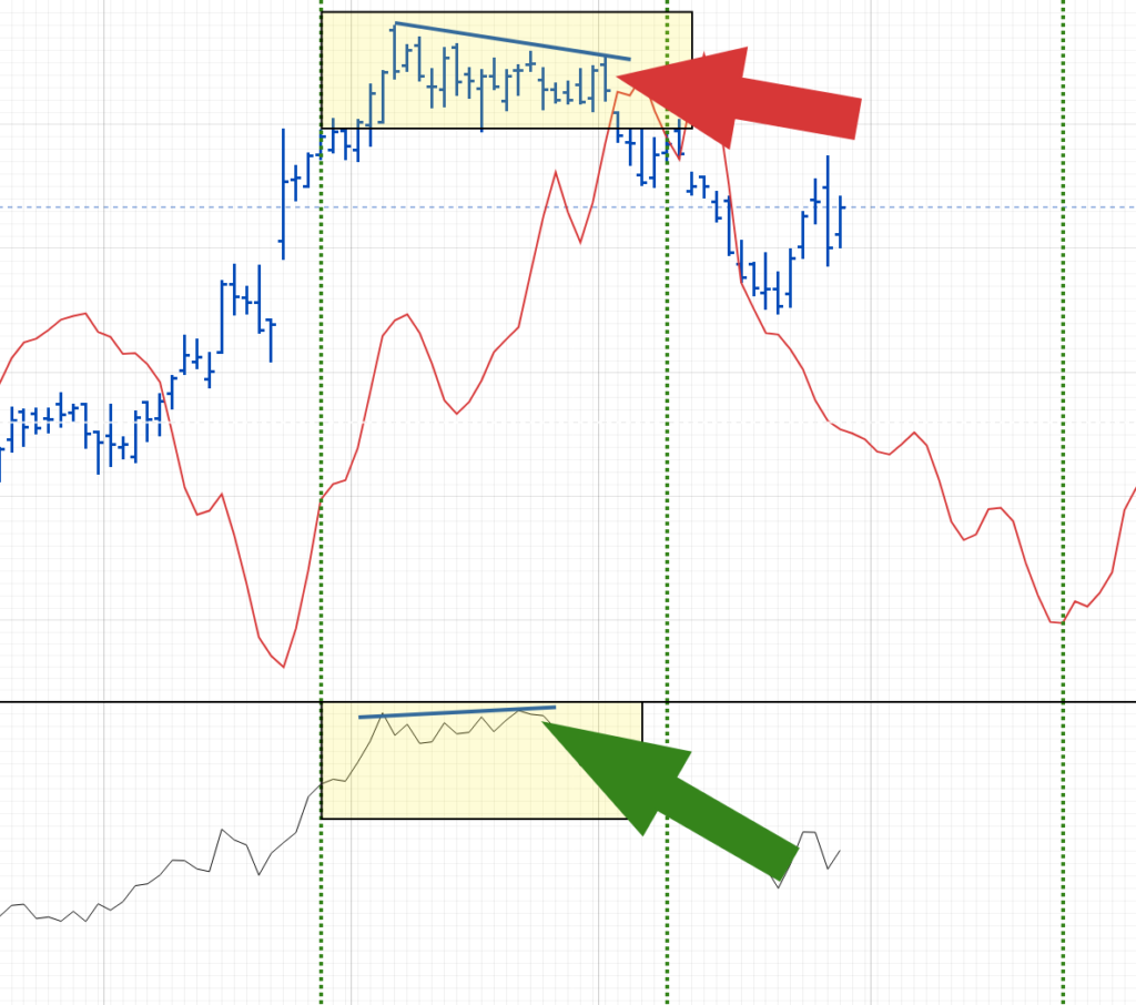
The chart above shows what is called “reverse bearish divergence”. It’s typically a bad omen for what’s ahead. When this pattern begins to print, it’s best to exit or hold off on taking long positions (buying to hold).
Many traders mis-read this setup as a “bullish divergence” – they see price action falling and the indicator rising.
However, the placement of the price action falling as near a top. The indicator below (this happens to be a simple accumulation/distribution line) indicates a “bullish” bias – it is rising slightly.
But as explained earlier in this article, PRICE ACTION IS KING – we take our cues from price action and let indicators be supporting and refuting evidence only.
So, next time you see price action showing weakness like that near a topping formation, and a favorite indicator of yours is flashing a “bullish” sign for you, remember it is most likely bearish – dubbed “reverse bearish divergence” because it is the opposite of a bullish divergence at a price bottom.
Happy trading.
